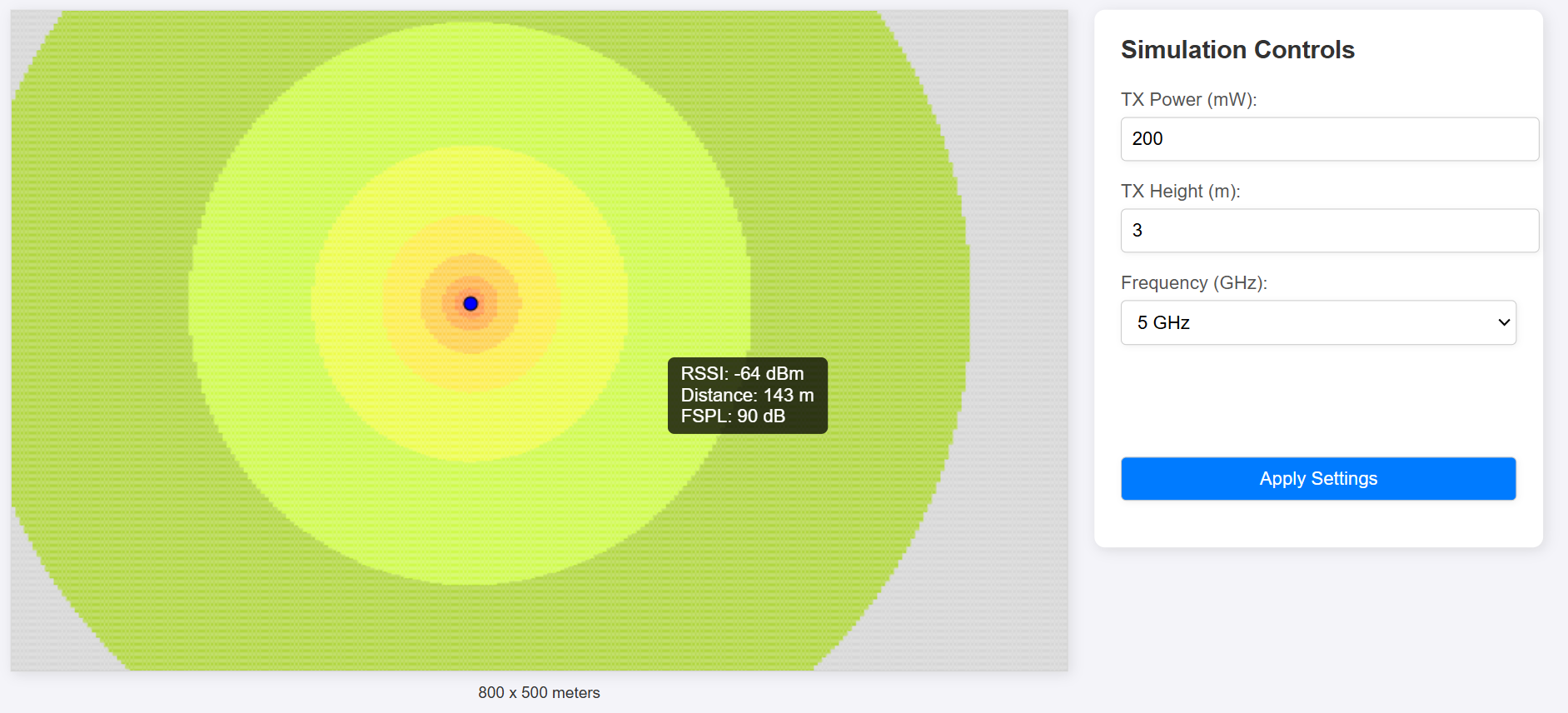
One of the most important parameters in any wireless modeling software is FSPL (Free Space Path Loss). This parameter models power loss as a function of distance, with frequency being another critical factor.
Higher frequencies result in lower received power due to the smaller antenna aperture, which directly affects how densely the signal is received compared to lower frequencies.
Wireless modeling tools typically display the received RSSI (Received Signal Strength Indicator) using a color-coded scheme, creating a heatmap. Areas with higher signal strength appear brighter than those with lower signal strength. These tools often support various ways to visualize the data.
The purpose of this post is to demonstrate a simple method for visualizing signal strength affected by FSPL using HTML, JavaScript, and CSS. This is not intended to provide code or steps for creating a production tool, but rather to share a straightforward approach to plotting the data.
Basic Steps
The HTML <canvas> element is used to render the graphical elements. A canvas of 800 x 500 pixels was created, where each pixel represents one meter.
There are two primary classes: Transmitter and CanvasPlot.
Handles the logic for dividing the canvas into ‘blocks,’ each containing a row and column.
Transmitter Class:
Models an access point with attributes such as transmit power, height, and frequency.
Includes two key methods: one for calculating the distance and another for determining the FSPL at a given point.
CanvasPlot Class:
Manages the visualization of data on the screen.
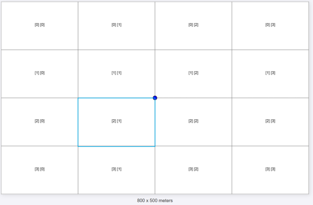
This is an example of a CanvasPlot with 4 rows and 4 columns.
The blue circle represents a Transmitter positioned at the center of the canvas. The values shown inside each block represent the row and column indices of the block, starting from row 0 and column 0.
An important step in the process is calculating the center of each block. The distance from the center of a block to the Transmitter is used in the FSPL calculation.
For example, if we want to calculate the center of the block [2][1] (which is in the third row and the second column):.
Parameters:
column to be calculated = 2
row to be calculated = 1
canvas.width = 800px
canvas.height = 500px
# rows = 4
# cols = 4
        this.cellWidth = canvas.width / cols;
        this.cellHeight = canvas.height / rows;
cellWidth = 800/4 = 200px
cellHeight = 500/4 = 125px
    // Method to calculate the center of a cell
    getCellCenter(row, col) {
        const centerX = col * this.cellWidth + this.cellWidth / 2;
        const centerY = row * this.cellHeight + this.cellHeight / 2;
        return { centerX, centerY };
    }
centerX = 1 * 200 + 200/2 = 300.5px
centerY = 2 * 125 + 125/2 = 312.5px
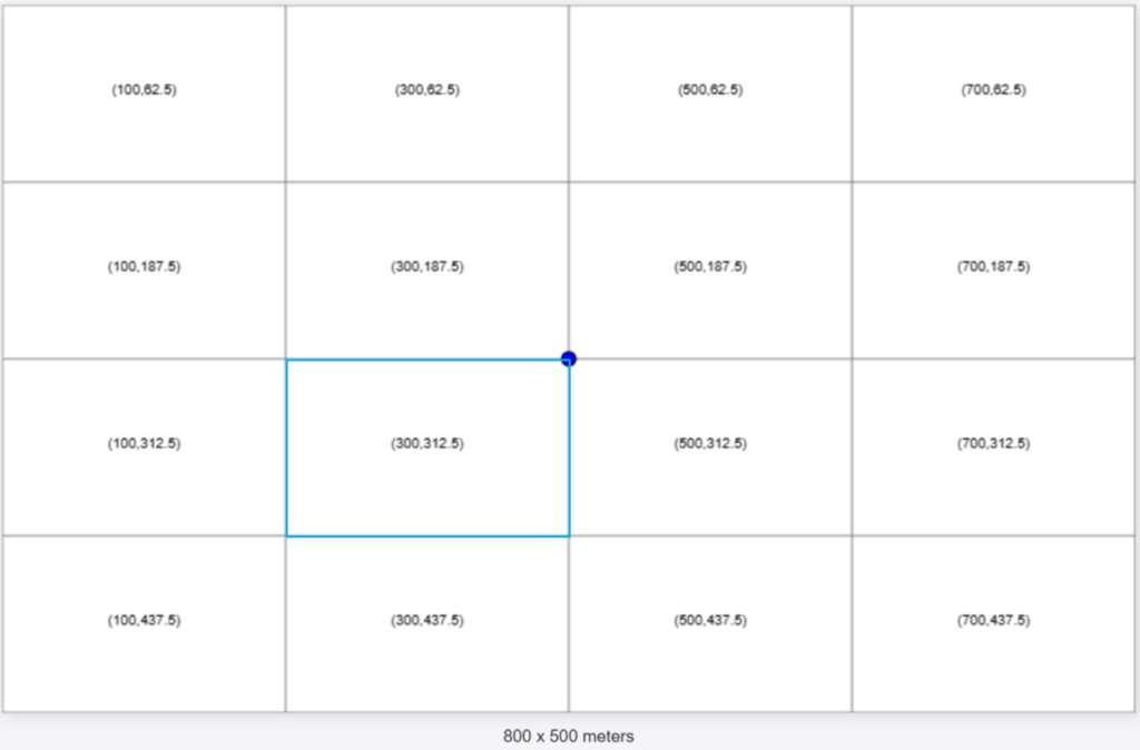
Now we can calculate the distance from the Transmitter to each block. In this example, the transmitter is positioned at the center of the canvas, at coordinates (400, 250).
The formula for the distance between two points (x1, y1, z1) and (x2, y2, z1) is:
d = √((x2 – x1)² + (y2 – y1)² + (z2 – z1)²)
The Transmitter class includes a function that receives the center point of a block and calculates the distance.
For block [2][1], the center was calculated as (300,312.5). Using the formula, the distance to the transmitter is:
d = √((300 – 400)² + (312.5 – 250)² + (0 – 0)²) = 117.92
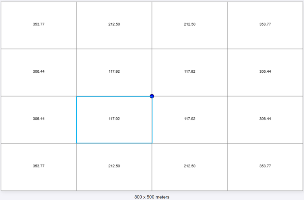
Now that we have the pieces in place, we can calculate the Free Space Path Loss (FSPL) using the formula:
FSPL (dB) = 20 log10(d) + 20 log10(f) – 147.55
Where d is the distance in meters (We are assuming 1px is a meter) the f is the frequency in Herz.
For 2.4 GHz (2400000000 Hz) on the block [2][1] we would have:
FSPL (dB) [2][1] = 20 log10(117.92) + 20 log10(2400000000) – 147.55
FSPL (dB) [2][1] = 81.48 dB
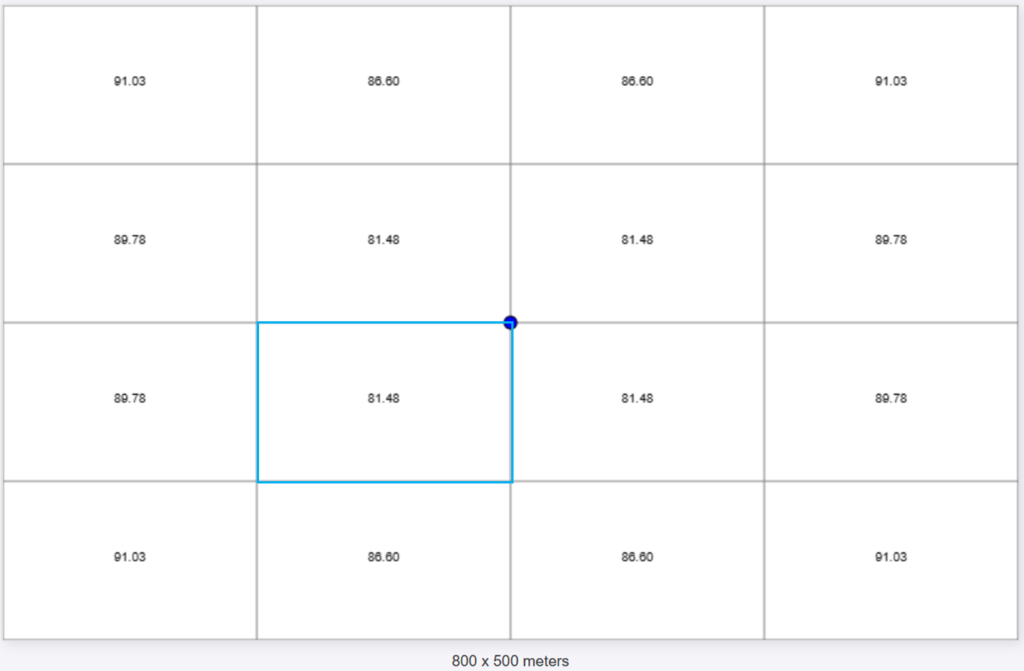
Cool, now we the FSPL for each block. The last two steps are:
- Calculate the Signal Strength;
- Color code it to plot over the grid.
Calculating the Signal Strength is very straight form, it is only necessary to subtract the FSPL from it.
For this example I will use a Transmitter with 100mW (20dBm), calculating for the block [2][1] we will have:
Signal Strength [2][1] = TxPower – FSPL
Signal Strength [2][1] = 20dBm – 81.48dB = -61,48 dBm
At this point we are modeling with zero gain of Tx and Rx.
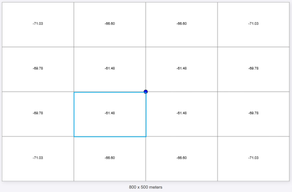
At this point, you’re probably tired of staring at a plain grid. Let’s spice things up with some color!
To make the signal strength visualization more intuitive, I’ve defined a simple color-coding scheme. Different signal ranges are represented by different colors, inspired by a Ekahau color palette often used for Wi-Fi heatmaps.
getSignalColor(signalStrength) {
    const colorMapping = [
        { min: -30, max: Infinity, color: "#FF4C4C" },
        { min: -35, max: -30, color: "#FF5A4C" },
        { min: -40, max: -35, color: "#FF784C" },
        { min: -45, max: -40, color: "#FE964C" },
        { min: -50, max: -45, color: "#FEB34C" },
        { min: -55, max: -50, color: "#FDD14C" },
        { min: -60, max: -55, color: "#FCEE4C" },
        { min: -65, max: -60, color: "#EDFC4C" },
        { min: -70, max: -65, color: "#CFFA4C" },
        { min: -75, max: -70, color: "#CFFA4C" },
        { min: -80, max: -75, color: "#D6D6D6" },
        { min: -Infinity, max: -80, color: "gray" },
    ];

    for (const range of colorMapping) {
        if (signalStrength >= range.min && signalStrength < range.max) {
            return range.color;
        }
    }

    return "gray"; // Default color
}
As we can see the resolution is not good, since the blocks are too big. Let’s hide the text and make the grid more dense (100×100).
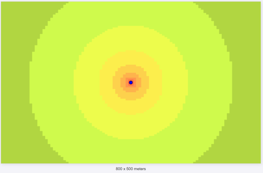
Now the signal propagation is clearer!
Increasing the resolution to 400 x 250
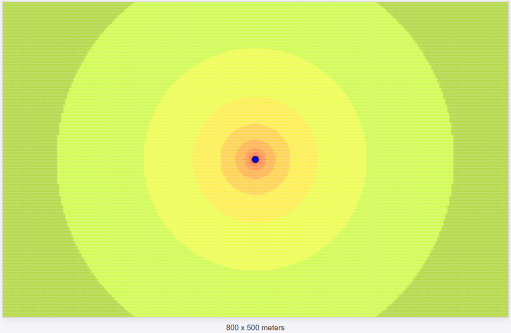
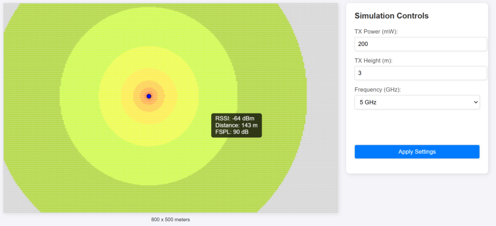
I added some features to change the position, frequency, height, TxPower.
The tooltip features makes it easier to see the RSSI, distance and FSPL of the current mouse position.
The code is available on the github: https://github.com/dcapassi/js_simple_propagation_simulation
The next steps are adding the gain of the antenna, walls, 3d.
I hope that you like it.
Thanks,
Diego Capassi
